Warm Light or Cool Light for a Reading Corner?
Warm light or cool light for a reading corner? Compare page clarity, glare, shadows, and room color to choose a lamp that feels comfortable where you read.
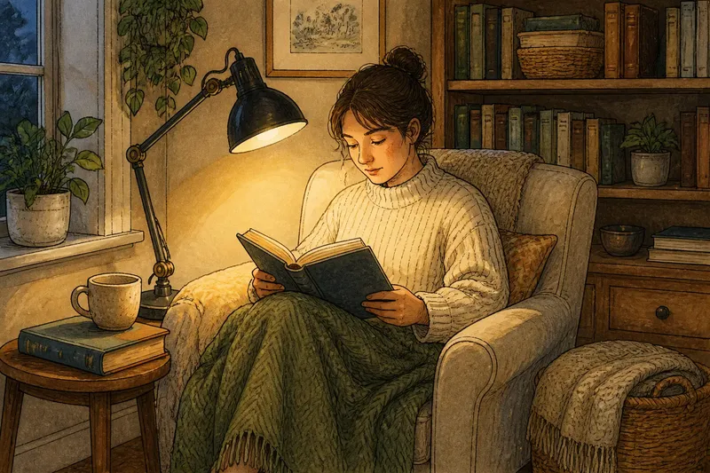
You settle into an armchair with a book, switch on the reading lamp, and find the page looks strangely yellow—or stark and bluish. Choosing warm light or cool light for a reading corner starts with what you see from that seat, not with a bulb label. The right choice keeps the page clear and suits the room around you.
“Warm” and “cool” describe the apparent color of white light, not how hot a bulb feels. Warm light tends toward amber; cool light appears more neutral or blue. Bulb packages often list color temperature in kelvins: lower values look warmer and higher values look cooler. The label is a useful starting point, but it cannot show exactly how a bulb will look in your room.
Identify what feels wrong before changing the light
A reading corner can be uncomfortable for several reasons that are easy to mistake for a color preference. The page might look tinted, the bulb might shine into your eyes, or a nearby wall might seem gloomy. Changing color temperature will not solve every problem, so identify the symptom first.
- The page looks too yellow: Check whether white paper looks amber with the lamp on. If it does, try a less warm light; if the tint is not the problem, keep the color and check the lamp’s position instead.
- The light feels cold or clinical: Compare it with warm wood, cream fabric, and nearby lamps. If the reading light looks noticeably bluer, try a warmer option; if it blends in, look for another cause of discomfort.
- Letters are hard to see: Check whether the beam reaches the page and whether the paper reflects the bulb. If the page is dim or glossy glare appears, adjust the lamp or shade; if the page is evenly lit, then compare color options.
- The corner looks flat: Check whether the wall and chair disappear into darkness around the bright page. If they do, add gentle reflected light; if the surrounding area is already visible, keep the room lighting as it is.
- Your hand casts a shadow: Check whether your writing or reading hand blocks the beam. If it does, move the lamp to the other side of the book; if the page is clear, avoid changing the setup unnecessarily.
- The light distracts you: Check whether you can see the bulb directly from your chair. If you can, use a suitable shade or reposition the lamp; if the source is already shielded, test whether a different color better suits the room.
Think of color temperature like the tint of a window: it changes the character of what you see, but it does not determine whether the window faces the right direction. Settle glare and placement before deciding that a warmer or cooler bulb is the whole answer.
Warm light makes a reading corner feel softer
Warm light often makes wood, woven baskets, muted paint, and soft upholstery feel richer. It can help a chair beside a sofa feel connected to the room’s evening atmosphere. Readers who prefer a relaxed, candlelike impression may enjoy it, especially when the reading corner is also a place to unwind.
The amber cast can make bright white pages look cream-colored and shift the appearance of colors on a book jacket. If you also use the corner to sort fabric swatches, very warm light may make those colors harder to judge. You do not need to rule out warm light; notice whether the page tint bothers you during ordinary reading.
Warm light can also feel dim against a dark room, even when the lamp seems strong enough. If the contrast between the page and its surroundings feels tiring, try adding gentle room light rather than immediately choosing the bluest bulb available.
Cool light keeps white pages looking crisp
Cooler light tends to make white paper look more neutral and can give a corner a clean, alert character. It may suit a room with pale, cool-toned finishes or a reader who dislikes an amber cast. Some people prefer it for close work involving fine printed details, though lamp position and page finish still matter.
The tradeoff is that cool light can look conspicuous among warm materials. It may make a comfortable chair feel more like a workstation, or make a small pool of light seem detached from the room. A cooler bulb is not automatically harsh, but a visibly blue-white source can distract if nearby lighting looks much warmer.
Look at the page and the room together. If the text seems clear but the corner feels severe, try a warmer setting; if the atmosphere feels pleasant but the page looks muddy, compare a more neutral or cooler setting.
Adjust glare and beam direction before swapping bulbs
Color is only one part of visual comfort. A bare bulb in your line of sight can feel glaring whether it is warm or cool. A shiny page can reflect the source toward your eyes, while an opaque shade can leave the book dim and the wall nearly black.
Adjust the lamp so its light reaches the page from the side rather than reflecting straight toward your face. A right-handed reader may find it useful to place the lamp on the left to reduce hand shadows; a left-handed reader may prefer the reverse. Treat this as a starting point, since the chair, table, and shade affect where shadows fall.
If the bulb is exposed, consider a shade or diffuser suited to the fixture. If the lamp has an adjustable head, aim it at the page rather than your eyes or a glossy surface. Make one change at a time, then read from your usual position to see whether the original annoyance has changed.
Compare the lamp with its surroundings
A reading lamp does not have to match every other light in the home, but strong differences can make the corner feel disconnected. Compare it with nearby ceiling or table lights after dark, when you are likely to read. If the reading spot looks like a separate island, try a bulb with a less contrasting color; if the corner already feels cohesive, keep the current one.
Daylight changes the comparison. A bulb that looks warm beside a window during the day may appear more neutral after sunset, when lamps light the room. Check your preference at the time you usually read and with the window in its ordinary position, rather than relying on how the bulb looked in a store.
Say a reader sits beside a honey-colored bookcase and a cream wall. Their cool-white lamp makes the page clear, but the corner looks bluish against the wood. They keep the lamp in place and try a less cool bulb; the expected result is a readable page with less visual contrast between the bookcase and the light. If the page then looks too yellow, they can return to the cooler option and soften the contrast with nearby room lighting instead.
Compare light colors without changing several things
If the lamp and bulb allow adjustments, compare options in the actual reading spot instead of judging from package labels alone. If the source is not adjustable, use a compatible bulb that suits the fixture and follow the product directions. For electrical compatibility and safe bulb selection, follow the fixture and bulb manufacturer’s instructions.
- Read at your usual time with the current lamp. Note the specific irritation: page tint, glare, a chilly feel, or a dark surrounding corner.
- Keep the chair, book, lamp position, and room lighting the same while changing only the light color.
- Look at ordinary white paper, printed text, and a nearby surface such as the wall or upholstery.
- Read a few pages from your usual position. If the light remains comfortable, keep that setting; if the original irritation persists, try a different color or address the lamp’s position.
- Choose the option that balances page clarity and room atmosphere for your routine. If neither setting works well, check glare and shadows before changing the bulb again.
If the choice remains close, an adjustable lamp or bulb with a selectable color setting can offer flexibility. That feature may help when the corner serves different purposes; if you mainly read there, a steady light that suits your routine may be simpler.
Questions about choosing reading-corner light?
Is warm light better for reading at night?
Warm light may feel more restful to someone who prefers a softer-looking room, but it is not automatically more comfortable for every reader. Check whether the page stays clear and the lamp avoids glare before deciding.
Does cool light make a book easier to read?
Cooler light can make white paper look less amber, which some readers prefer. Clear reading also depends on beam direction, shade design, and the contrast between the page and its surroundings.
Should a reading lamp match the ceiling light?
It does not need to match exactly, but a stark difference can make the corner feel separate. If that contrast bothers you, try a lamp color closer to the room’s other lighting.
What if the color looks right but the light still feels uncomfortable?
Check whether the bulb is exposed, the page reflects glare, or the beam misses the book. Adjusting the shade or lamp direction may help more than changing from warm to cool light.
Choose light that suits both the page and the room
Choose warm light or cool light for a reading corner from your seat, with the book open and the room in its usual evening arrangement. Warm light tends to soften the room’s character; cool light tends to keep whites looking crisp. Either can work if the page is legible and the lamp does not distract you.
Once a color feels right, leave the setup unchanged for a few reading sessions before making another adjustment. If discomfort returns, note whether it comes from page tint, glare, or shadows; that distinction will point you toward the next useful change.